Cureon · Graduate Thesis · Concept Product · Healthcare · Solo
Know what's covered. Walk in confident.
An AI-powered mobile app that turns dental insurance jargon into clear, actionable answers — coverage, costs, and care, understood before the appointment.
People delay dental care because they can't decode their own insurance — terminology, hidden costs, and coverage anxiety stand between them and treatment.
End-to-end solo design: survey and interview research, IA, flows, UI system, AI-guidance concept, prototyping, and usability testing.
A usability-tested final prototype — three participants across three initial sessions drove two major iterations reshaping two core screens; five participants then evaluated selected revised flows.
Graduate thesis concept. Estimates and AI answers are educational guidance, not official insurance information; no launch data.
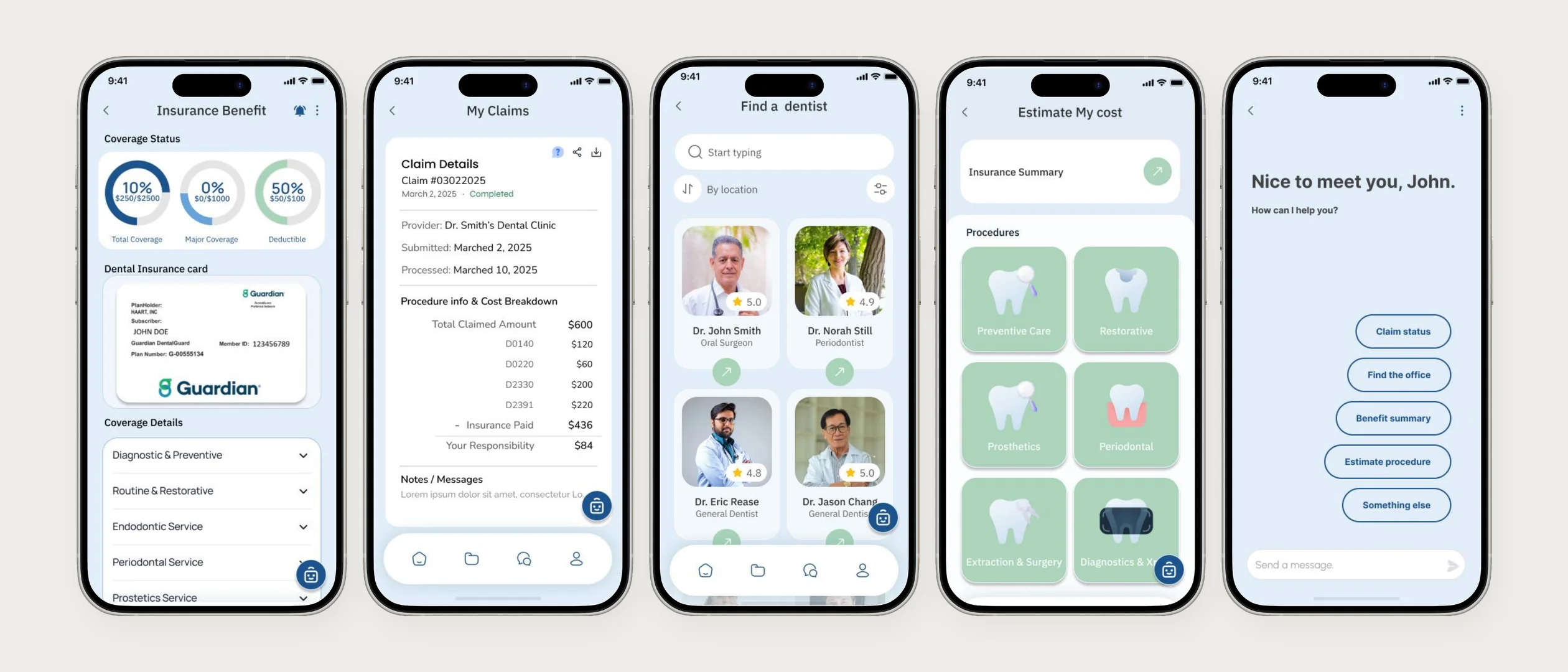
Five screens.
No surprises.
Coverage, claims, booking, estimates, and answers — everything Emily needed from the front desk, before she leaves home. The rest of this page shows the evidence and decisions behind it.
Most Americans have dental insurance. Most can't explain it.
People with employer-provided plans skip appointments, avoid asking questions, and get surprised by bills — missing benefits they've already paid for.
Cureon answers the question behind all of it — “what will this actually cost me?” — with plain language, upfront estimates, and an AI assistant.
The Problem
People have coverage — they just can't confidently use it. Confusing terminology, unpredictable costs, and fragmented booking, billing, and benefits stand in the way.
The data supported
what users were feeling.
Three survey findings set the agenda for everything that followed — each one pointing at understanding, not coverage, as the real gap.
7of 7
survey respondents couldn't accurately explain their dental plan's coverage for common procedures.
6of 7
survey respondents reported anxiety about unexpected costs when visiting the dentist.
6of 7
survey respondents wanted mobile access to coverage details and cost estimates before appointments.
Source: Cureon discovery survey, n=7.
- Method
- Survey
- Sample
- n=7
- Participant profile
- People with health-insurance experience who had encountered difficulty understanding coverage, benefits, or out-of-pocket costs
- Phase
- Discovery research
- Method
- Semi-structured interviews
- Sample
- n=8
- Participant profile
- People meeting the same health-insurance experience criteria
- Phase
- Discovery
I just want to know what's covered — and how much I'll owe.
Emily Cooper · Employed · Insured · Still confused
What existing apps
get wrong.
Three direct competitors, each solving a piece of the problem — none answering Emily's actual question.
Delta Dental
WeaknessPoor UI, no cost estimate tool, confusing navigation.
OpportunityTranslate raw plan data into plain language with upfront cost estimates.
Guardian
WeaknessNo AI chatbot, limited plain-language explanations.
OpportunityAdd AI-assisted guidance for the personal coverage questions a dashboard can't answer.
Zocdoc
WeaknessOverwhelming menus, no insurance transparency or cost estimates.
OpportunityPair provider booking with insurance transparency — cost per provider, before booking.
Four principles,
from evidence.
Research became a filter, not a report. Every screen that follows had to reduce a user's anxiety — or it was cut.
Clarity
Explain insurance in plain language anyone understands immediately. Every screen replaces terms like “annual maximum” with what they actually mean for the user.
Grounded in7 of 7 survey respondents couldn't explain their own coverage — terminology was the barrier, not the plan.
Transparency
Show benefit usage, coverage, and deductible progress at a glance — and put a number on every procedure before it happens.
Grounded in6 of 7 survey respondents reported cost anxiety — uncertainty, not price, is what delays care.
Smart support
An AI assistant answers coverage and cost questions in real time — questions no static FAQ can handle.
Grounded inUsers relied on office staff for answers their own tools couldn't give them.
Accessibility
A mobile-first flow usable without any prior insurance knowledge — because the critical moment is before the appointment, wherever the user happens to be.
Grounded in6 of 7 survey respondents wanted coverage details and estimates on mobile, before booking.
A visual system built
for clarity under stress.
Blue reinforces trust in a healthcare context; soft greens and warm neutrals keep the experience human. Alert coral is reserved exclusively for cost warnings — so it never loses its meaning.
Trust Blue · #1C538EMid Blue · #67A3DASky Tint · #BFDCE5Mint · #A8D5BAWarm Ground · #F4EAE0Alert Coral · #F88379Blue earns the trust — coral is spent only on cost warnings.
WCAG-compliant contrast on all cost figures, 44-pt touch targets, and no color-only meaning — alerts always pair coral with an icon and label.
IBM Plex Sans carries dense insurance information; Poppins adds warmth to headings — legibility first, personality second.
One shared set of coverage cards, progress bars, and status chips — plan information looks the same everywhere.
Five features solve the
problem end-to-end.
Each feature traces back to a number from the research — and each decision below carries the reasoning it had to defend.
Decision 01 · Coverage Overview
Plain language,
not plan language
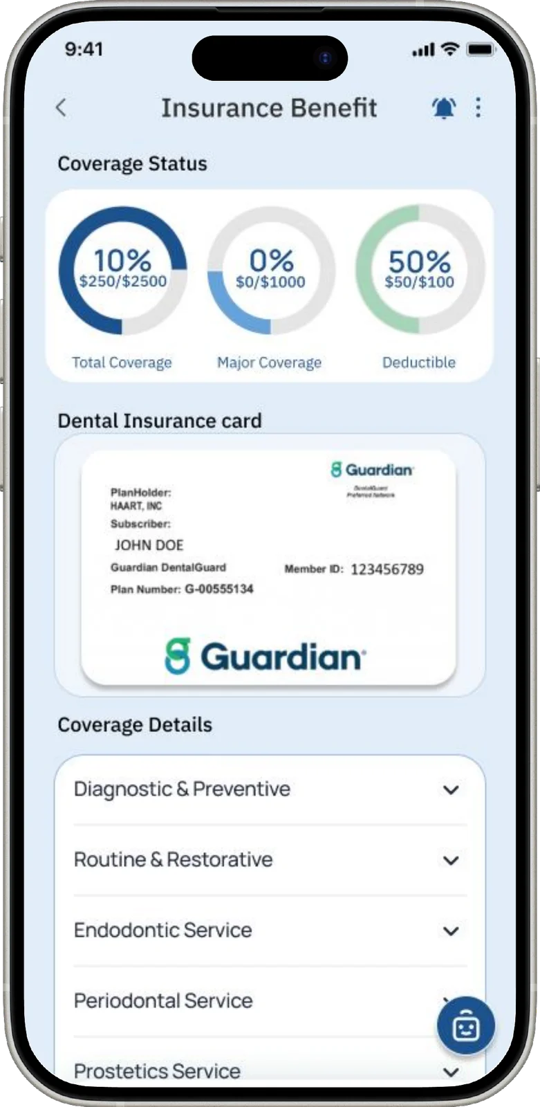
A dashboard that explains coverage, deductible progress, and remaining benefits in words anyone understands — no more 40-page benefit documents.
WhyGrounded in the survey's coverage-confusion finding (Finding 01) — so every screen replaces “annual maximum” with what it means for the user.
Decision 02 · Cost Estimator
See what you're likely
to owe, before you book.
Enter a procedure and see the expected out-of-pocket cost upfront — with a code-level breakdown that shows exactly how the number is built.
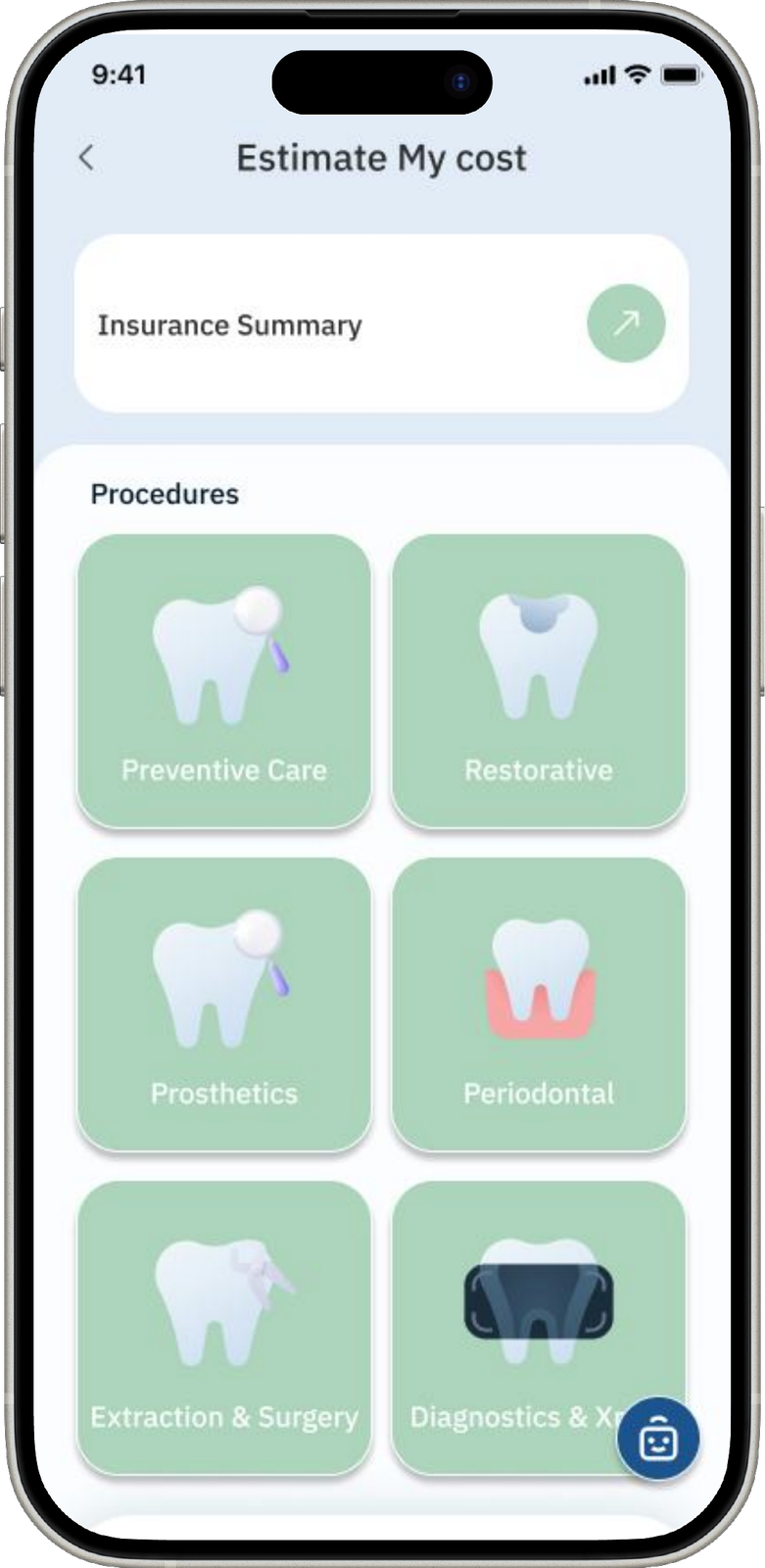
The feature participants responded to most positively in usability testing — aimed squarely at the survey's cost-anxiety finding (Finding 02).
Decision 03 · Provider Finder
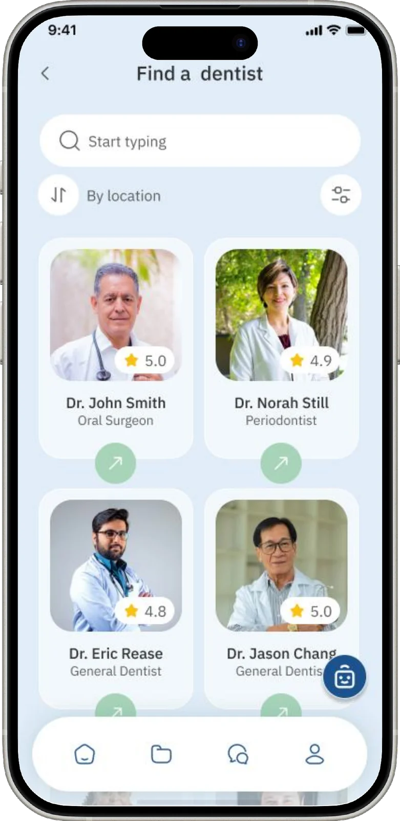
The right dentist,
without the phone calls
Compare in-network dentists on availability, coverage, and cost side by side — then book directly in the app.
WhyChecking in-network coverage meant calling office after office — the finder replaces the call-around entirely.
Decision 04 · Benefit Tracker
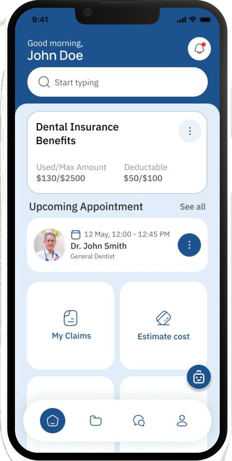
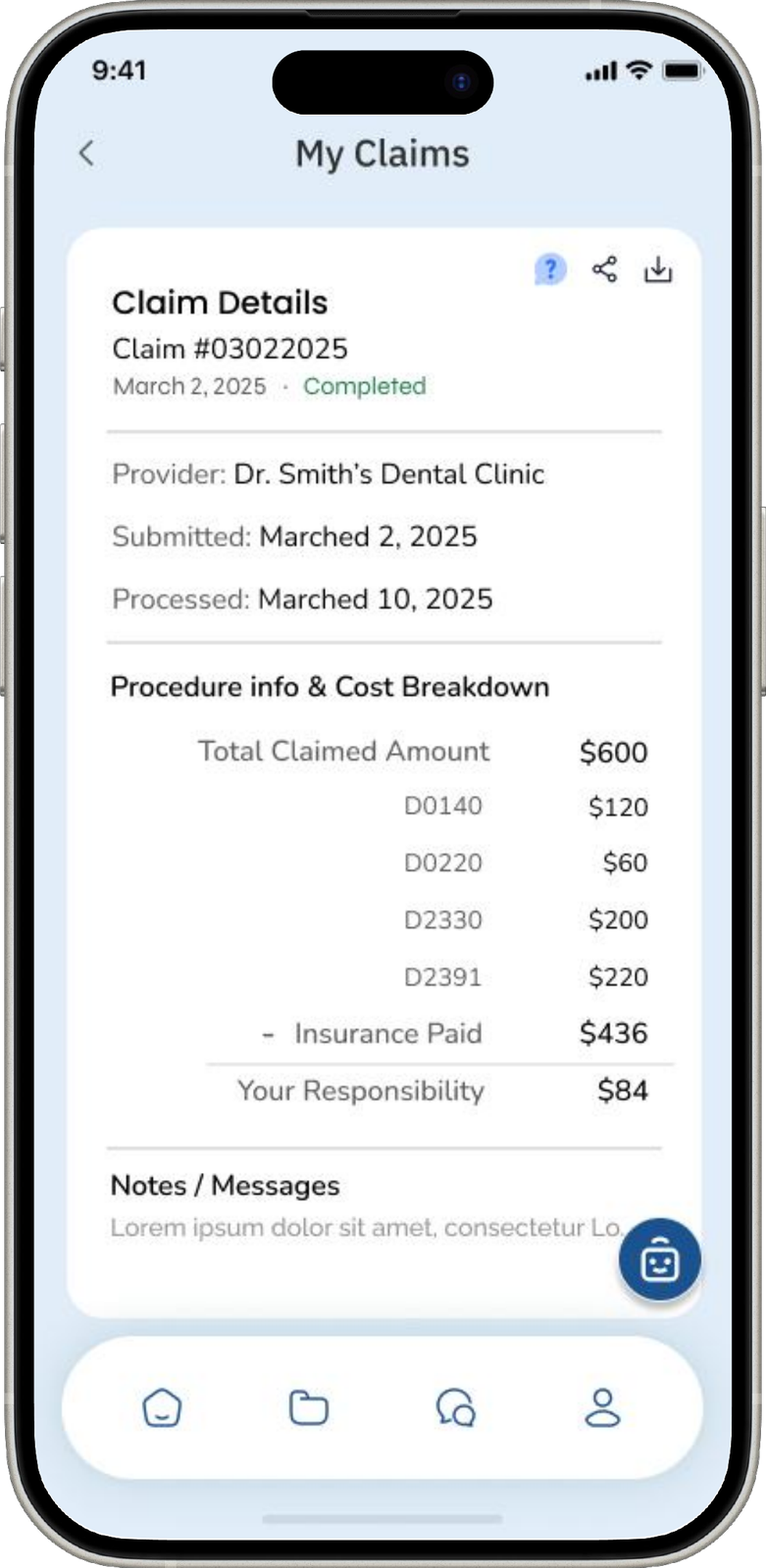
Never lose a benefit
to a missed deadline
Benefit usage and deductible progress live on the Home screen, with proactive reminders before benefits reset — and every claim itemized down to the procedure code.
WhyIn testing, users missed deductible info buried two levels deep. Surfacing it on Home turned passive plan data into timely action.
Decision 05 · AI Assistant
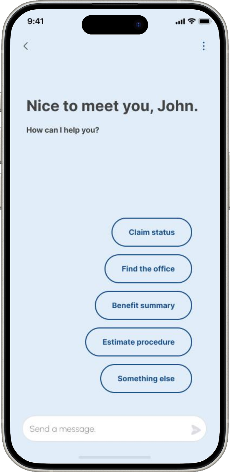
Answers, without
the front desk
An always-on assistant that answers coverage questions, explains billing, and guides users through claims — in the same plain language as the rest of the app.
WhyCoverage questions are personal — “is my crown covered?” can't be answered by a static FAQ. The assistant handles what users would otherwise ask office staff.
The solution,
in sixty seconds.
A recording of the working prototype — home dashboard, coverage and claims, provider booking, cost estimate, and the AI assistant, in one continuous flow.
Home dashboard → Coverage & claims → Provider booking → Cost estimate → AI assistant
Testing changed
the design.
Two phases, documented below — what testers struggled with became what changed.
- Method
- Moderated usability testing
- Sample
- n=3 across 3 sessions
- Design response
- 2 major design iterations
- Method
- Targeted moderated usability testing
- Sample
- n=5 · same recruitment criteria
- Scope
- Selected revised flows
- Limitation
- The full product was not retested
Deductible info → the Home screen
Deductible information sat two levels deep in the Benefits tab. The response: deductible progress moved to the Home dashboard, in plain language.
Cost ranges → code-level breakdowns
Testers asked “why is it $120–$310?” and didn't trust the number. The response: a code-level breakdown showing how the range is calculated.
I finally understood what my deductible actually meant — the progress bar made it click.
Jin Choi · Tester 01
I love that I can see the expected cost before visiting. It reduces my anxiety.
Jisoo Lee · Tester 02
The reset reminder on the home screen would've saved my cleaning benefit last year.
Paul Patrick · Tester 03
Calm, for a
stressful subject.
Every dollar, itemizedClaims broken down to the procedure code — the transparency that made testers trust the numbers.
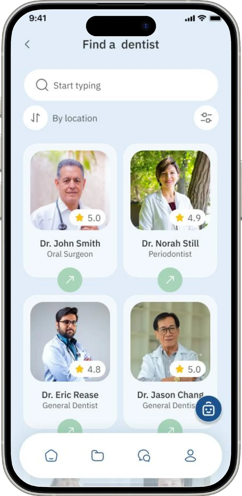
Find, compare, bookIn-network providers with coverage and cost side by side — no phone calls required.
The core system — coverage, claims, provider finder, cost estimator, and the AI assistant
What this concept
can — and can't — promise.
Cureon touches money, health, and AI guidance — its limits matter as much as its features.
Plan details vary by employer and change yearly — a real deployment needs verified data sources.
Estimates are educational ranges, not quotes — they should never read like a bill.
AI explanations can be wrong or oversimplified — guidance is educational, not a replacement for the plan document.
Consent, storage, and regulatory review sit outside this thesis's scope — prerequisites for a real product.
Full WCAG conformance and assistive-technology testing remain future work.
Users may over-rely on AI answers — disclaimers at decision moments and paths to human help are essential.
09 — Reflection
Research prevented unnecessary features — every screen had to reduce user anxiety, or it was cut. That discipline produced the cost estimator, the feature participants responded to most positively in testing.
Testing at high fidelity meant the deductible fix came two iterations late — wireframe-stage testing would have caught it sooner.
Validate the AI assistant against real insurance data, and measure how cost transparency influences trust and appointment confidence.
This project taught me that in healthcare, clarity is a form of care. The clearest screen is the one that removes a worry.